This post was inspired by an article on WealthManagement.com by April Rudin, in which she blasts financial services firms for using the same, clichéd images as everyone else.
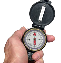
If I rounded up the advisor websites with a lighthouse, a compass, or a road winding into the woods or off to the horizon, I would probably capture 90% of them. Add to that with two seniors walking hand in hand or in the Cialis ad with his and hers bathtubs looking off into the distance, I probably have the rest of them. (And based on the brand promise, why are they in separate tubs anyway?). I actually had a participant in a client advisory board make the comment “We’re tired of the Cialis ads” when providing feedback on the advisor’s marketing materials. Nice.
OK, so everybody uses them; what’s the problem? It makes you the same as everyone else. That being the case, despite what you may believe about that compass on your site, it gives people no reason to come see you. It is what David Meerman Scott refers to as “Visual Gobbledygook.” If it doesn’t serve to reinforce what’s special about you, it doesn’t belong on your home page.
Besides, as Rudin points out, it is not even clear that the imagery represents what clients are looking for. The narrative of the client being lost in the fog, in search of some guiding light to help them navigate the rocky shoals of their financial lives, may not resonate. That’s not what I want from my financial advisor. Or lawyer, or CPA. I want someone who will consult with me, maybe coach me. I am not a poor lost soul looking for direction. I have a pretty good idea where I want to go. I need a little advice on how best to get there.
Whatever imagery you put in your brochures and on your web page should say something about what makes you different and what special thing you have to offer your target client. One brilliant site for a firm that advises professional athletes has a close-up of a player holding a football helmet (with corresponding text about a particular need faced by retired football players).
Once you work with your clients to discover the narrative of what is unique about your firm, look for images that support that. And if you can’t find any, consider a web page without a picture. A simple graphic element or icon would be better than a hackneyed old cliché that advertises that you are the same as all the other firms your prospect will talk to.


Bravo! And could I add chess pieces to your list? Your sentence – "If it doesn’t serve to reinforce what’s special about you, it doesn’t belong on your home page" – says it all! Thank you!!
Susan,
You're right! I forgot chess pieces. If we include them in the mix, we probably have covered 95% of all advisor websites! Thanks for adding that.
Steve